Pastel Blue Color
Meaning, Hex Code, Palette & AI Ideas
Pastel Blue at a glance
What Does Pastel Blue Mean?
Pastel Blue is a soothing hue that evokes a deep sense of calmness and intellectual openness. It is often used to create environments that feel light, airy, and emotionally restorative.
Symbolically, it represents clarity, purity, and a harmonious connection to the ethereal. Historically, it has been associated with peace and high-end elegance across multiple cultures.
In design, Pastel Blue serves as a modern neutral-alternative that reduces visual fatigue. It is a favorite for minimalist user interfaces and wellness-focused branding.
Standard Color Codes
CSS Usage
color: #AEC6CF;background-color: #AEC6CF;Pastel Blue Color Palette
What Colors Go Well With Pastel Blue?
Complementary
High contrast and vibrant, ideal for headlines and CTA buttons.
#513930Analogous 1
Harmonious and pleasing to the eye, perfect for sophisticated branding.
#AFB6D0Analogous 2
Natural and serene palette, best for wellness and lifestyle designs.
#AFD0C8Shades & Variations of Pastel Blue
Pale Pastel Blue
#EFF4F6Light Pastel Blue
#DFE9ECBase Pastel Blue
#AEC6CFDeep Pastel Blue
#6E9AAADark Pastel Blue
#426470Best Scenarios for Pastel Blue
UI Design
Use Pastel Blue as a refined enterprise interfaces element to create a modern and trustworthy digital experience.
Branding
In professional branding, Pastel Blue conveys trust and pairs seamlessly with clean whites.
Interior
Integrate Pastel Blue in luxury environments to foster a sense of serenity and modern elegance.
Marketing
Pastel Blue is ideal for modern visual marketing that requires both high-engagement and clarity.
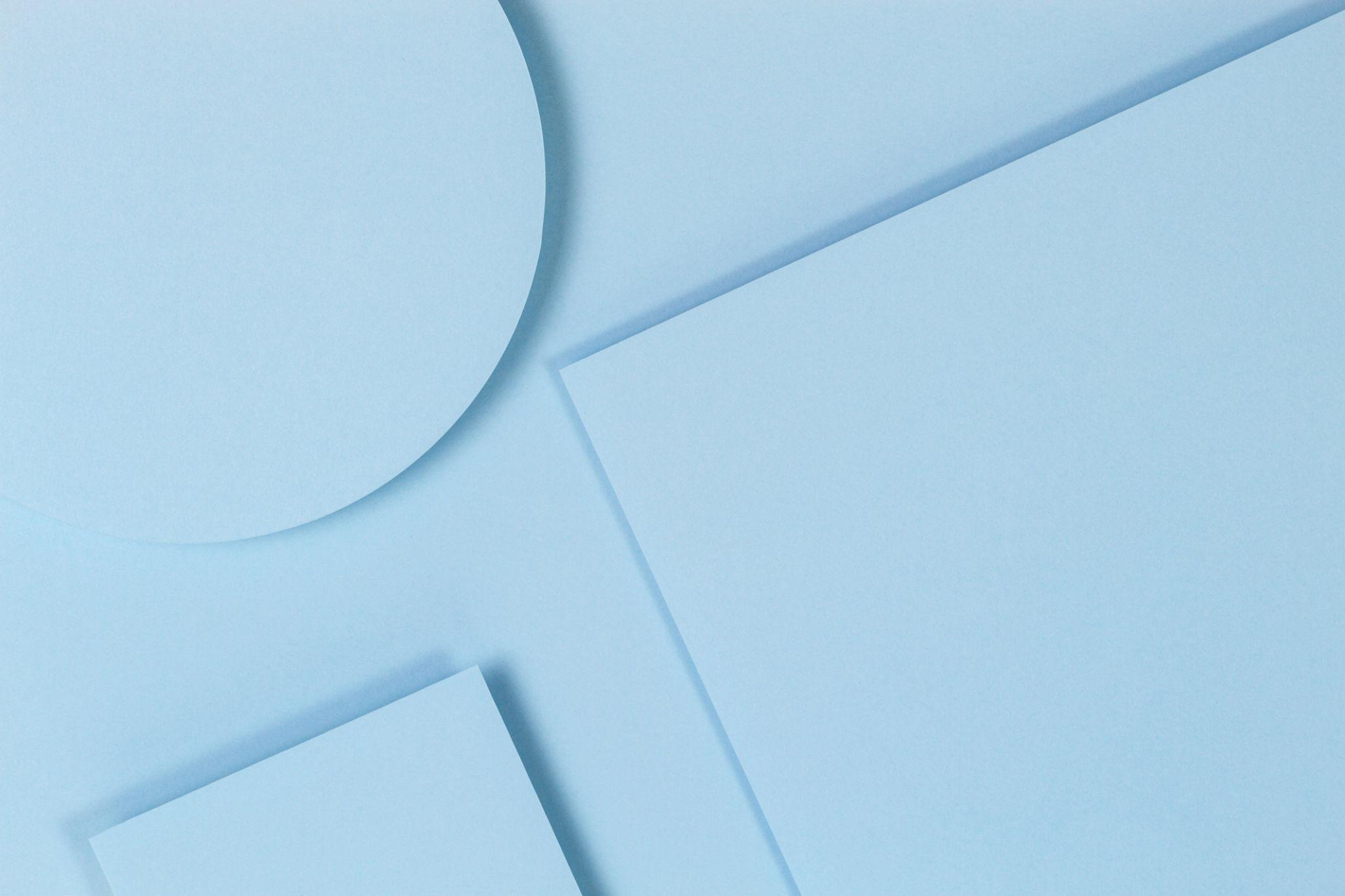
Composition
Leverage Pastel Blue in complex backgrounds to highlight the depth and technical precision of your subject.
Pastel Blue AI Prompts
PRO FEATURE"Pastel Blue minimalist architectural visual, volumetric lighting, 8k cinematically sharp"
"Pastel Blue luxury product background for jewelry, studio lighting, macro details"
"Pastel Blue fluid abstract waves wallpaper, 3D render, smooth gradients"
"Pastel Blue high-fashion editorial, modern street style, urban cinematic mood"
"minimalist editorial layout featuring Pastel Blue geometric accents, swiss design"
Featured Design Examples
Minimalist poster design featuring Pastel Blue geometric accents
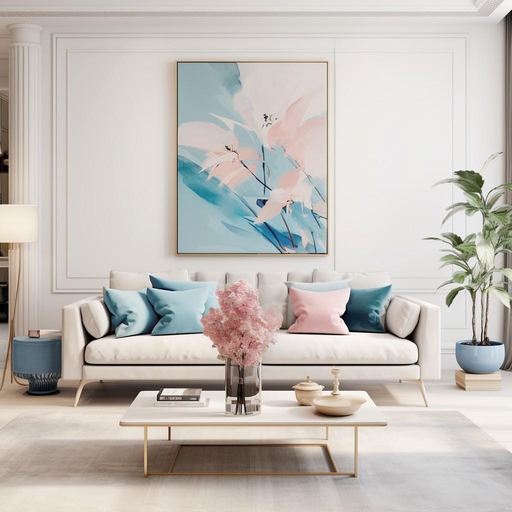
Sophisticated interior space utilizing Pastel Blue as a focal point
Premium product mockup with a clean Pastel Blue studio backdrop
Related Colors
FAQs About Pastel Blue
Pastel blue is a soft, light tint of blue that feels gentle and restrained, often associated with clear skies and calm water.
It is a cool color, known for its ability to lower the visual 'temperature' of a room or screen design.
It pairs beautifully with crisp whites, soft grays, and muted gold accents for a sophisticated, airy palette.
Use it as a primary background color for apps or websites that prioritize readability and user comfort.
It symbolizes tranquility, trust, and fresh beginnings, making it ideal for healthcare or baby brands.